





















Times are changing. So are the Icon logos


Times are changing. So are the Icon logos.
The Bluffton Icon and sister website, Ada Icon, this week introduce new logos to viewers. The logos unveiling is today.
The redesign project started in May and included several versions and fine-tuning.
"We wanted a uniquely Bluffton and Ada look and feel to our logos," said Fred Steiner of the Icon. "Changing logos isn't something you do overnight. It takes planning, studying other logos and a desire to make viewers feel at home on our websites. We think these new logos achieve that hometown feel."
"We chose the Bluffton town hall and Ada railroad depot because, excuse the pun, they are both iconic images in their respective communities."
Bluffton graphic artist, Kat Luginbuhl, created the new logos. She is a Bluffton High School and Goshen College graduate, and is manager of Gallery 323. As a freelance graphic artist, she also designed the cover of “The Bluffton We Never Knew,” photo history book published this year by the Icon.
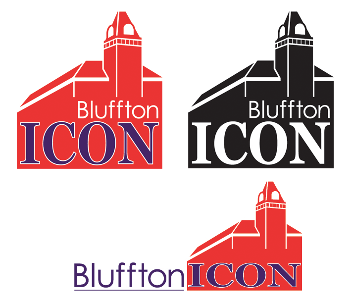
Bluffton Icon
The logo colors of red, purple and white reflect Bluffton High School and Bluffton University colors. The state outline is replaced with an image of the Bluffton town hall. Fonts used are Century Gothic for the word “Bluffton” and Baskerville for the word “Icon.”
Bluffton will interchange three versions of its new logo. A square logo is used as the masthead. Another is black and white for appropriate one-color usage. The third is a horizontal version.
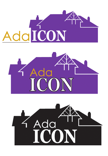
Ada Icon
The logo colors of purple, gold and white with a black underline reflect Ada High School and Ohio Northern University. The state outline is replaced with an image of the historic Ada railroad depot. Fonts used are Century Gothic and Baskerville.
Ada also has three versions of its new logo. A square logo is used as the masthead. Another is black and white for appropriate one-color usage. The third is horizontal version.
The retired logos
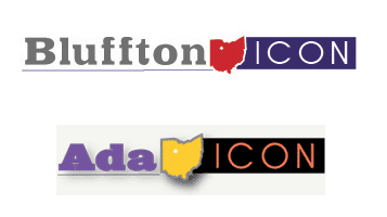
Ronson Slagle, a graphic designer in Cincinnati, designed the original State of Ohio-outline Icon logos. They were introduced on the Icons at the launch of the Ada Icon in 2012.
The idea behind the Icon Ohio logos were that a geographic identifier was needed to show the location of Bluffton and Ada in Ohio, since both Icons were relative unknowns in the news world.
Many newspapers update their layout design scheme about every five years. The Icon owners decided it was time for a new logo that reflected a hometown feel.


Stories Posted This Week
Friday, October 23, 2026
- Village of Bluffton announces late afternoon drill at Bluffton Schools, October 23
- October 23 Bluffton Schools athletics lineup, streaming
- Pirate volleyball eliminated in sectionals by Archbold
- Pirate boys soccer knocked off by Bath
- Main St. closure rescheduled; parapet work to take place Oct. 27
- Bluffton student to reflect on diabetes research experience
- Bluffton University receives $8,000 Stinner Summit award for youth agricultural and environmental education
- Elections matter, including midterms
Thursday, October 22, 2026
- Ada Icon headlines, October 22
- ICAPP study: Ohioans strongly oppose data center expansion and tax breaks
- Pirate girls soccer ousts rival Allen East in sectionals
- Strawberry Fields Forever: Fruit polyphenols and brain health
- Last call for Bluffton Cars & Coffee for 2026
- Icon calendar gets a little more elbow room
- Bluffton Board of Education recap: Contracts for coaches and new bus driver
- Bluffton Lions Club update for October 2026
- Bluffton chamber photo competition display and reception announced
- Bluejays and buzzards catch the eye of this Accounting prof
Wednesday, October 21, 2026
- Ada Icon headlines, October 21
- Village of Beaverdam requests suggestions for park grant application
- Charles “Chuck” Wendall Collins, 63, owned Eagle Press Repairs
- Dwain L. Leiber, 87, owned Leiber Garage
- Kimberly Dawn Murphy, 55, taught at Findlay City Schools
- Kaleidoscope Farms honoring veterans, thanking current troops, Nov. 8
- Filmmaker to preview documentary exploring life beyond incarceration
- ONU mobile health clinic at Senior Center on Oct. 28
Tuesday, October 20, 2026
- Columbus Grove-Bluffton Rd. closure planned for up to three weeks
- Two Pirate volleyball players make 1st team All-NWC
- 3 Pirate girls 1st team All-NWC soccer
- Pirates dominate All-NWC boys soccer awards
- Local filmmaker focuses on memories made by people and places
- Bluffton Public Library: Medicare 101
- BHS artists prepare Yankee Doodle Christmas Trees for Jingle Bell Stroll
Monday, October 19, 2026
- Beavers sports roundup, October 14-18
- Ada Icon headlines, October 19
- JessExpress Travel is the Icon's newest advertiser
- Gatchel 7th in girls, Pirates 4th at NWC cross country meet
- Veterans invited to Pandora-Gilboa banquet, November 10
- Wearable sculptures featured in exhibit On Soft Ground
- Historic depot rentals offered for meetings and parties